REDESIGNING & REBRANDING For an e-commerce website
mirror

Framework: Designlab’s UX Academy
Timeline: June-August 2019
My Role: UX Design
Tools: Figma, POP by Marvel, Invision, Zeplin
THE PROBLEM:
Mirror is a popular fast-fashion clothing store that currently has over 400 stores in 32 countries. Customers praise Mirror’s modern, neutral and clean feel, while appreciating that their low prices make the fashionable clothing accessible to everyone. Mirror has put their focus on their in-person experience, neglecting the opportunity to expand to the online retail market.
THE SOLUTION:
Completely redesign Mirror’s branding and website to be a fully responsive e-commerce website.
* Please note that this is a conceptual project, and Mirror is a fictitious company.
STEP ONE
RESEARCH
Goal: To identify demographics, trends and goals of the clothing retail market and to identify Mirror’s target market
Process: Market Research, Competitive Analysis, Interviews
Research Goals:
-
Understand the current market of online retailers.
-
Understand why customers shop online.
-
Identify what features customers rely on when placing online orders.
-
Identify existing pain-points and preferences customers have when using competitors’ websites
Methodologies:
• Market research: Review industry statistics, trends, and demographics
• Competitive analysis: Identify competitors, analyze their website functionalities (categories, filters, features, UI), and identify strengths and weaknesses
• User interviews: Meet with participants to discuss their preferences and pain points when shopping both in-person and online
Market Research
To begin, I researched online shopping and the e-commerce clothing business. I focused my research on the American market, where online shopping has flourished, to give me an idea of the trends and potential in online shopping that markets in Israel can take advantage of.
-
79% of Americans say that they make purchases online
-
51% of Americans say that they make purchases on cell phones
-
15% of Americans say that they make purchases online on a weekly basis
-
64% of Americans say that they prefer shopping in physical stores
-
73% of shopping journeys begin with shoppers looking for a specific item or visiting a multi-brand store
-
68% of journeys were one-stop purchases
-
64% of journeys took less than an hour
-
Despite the hype, over 75% of branded apparel purchases are made in store rather than online
-
When customers shopped online, the number of items and amount spent was larger
-
90% of 18- to 29-year-olds ever buy items online, while 77% have purchased something using their cellphones and 24% have bought something by following a link on social media
-
A majority (95%) of those 65 and older ever generally make purchases—but only e 17% have bought something using their cellphones and just 5% have done so through a social media link
-
Mobile devices: 52% of eCommerce traffic was generated from mobile devices
-
Social media: Encompasses target market’s lifestyle and connects with them on an emotional level
-
Free and quick shipping
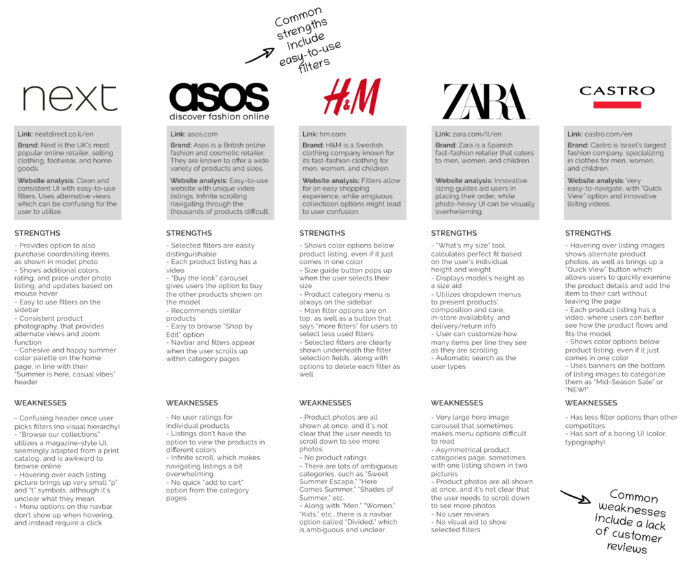
COMPETITIVE ANALYSIS
Because Mirror is in such a saturated market, I researched its competitors to make note of what made them successful, as well as how Mirror could best position itself to be a strong contender within the Israeli clothing e-commerce market.
user interviews
In order to have an understanding of users’ primary needs and pain-points, I conducted contextual inquiry interviews with four participants about their in-store and online shopping habits. The participants were three women and one man between the ages of 25-35. Two of the women are moms, one of whom also works part-time. The remaining man and woman are full-time professionals. My interviews revealed a few key findings, most noticeably reluctance about ordering online due to fear of improper fit or unexpected materials.
Needs
-
To quickly find what they are looking for: All 4 participants stated that they rely on filters to quickly find items that they’re looking for when shopping for clothes online. These filters include size, price, fit (sleeve length, skirt length), color, and category.
-
To trust that the clothes will fit properly: All 3 women stated reluctance to order online due to fear of clothing not being flattering. In order for a clothing website to be successful, it must find a way to abate those fears.
-
To have a strong understanding of the clothes’ materials: All 3 women stated that they have concerns about materials when placing online orders, as they can’t see and feel what the product is made of.
-
To feel like they are getting a good deal: All four participants cited affordability as an important factor when shopping for clothes. The male participant stated that he only buys clothing when he knows he’s getting a good deal, and therefore will only buy when there is a sale or promotion.
Pain Points
-
Sizing: All 3 women stated reluctance to order online for themselves due to fear of clothing not being flattering.
-
Material: All 3 women stated that they have concerns about materials when placing online orders.
-
Checkout: One participant mentioned that she would like to order from a particular website, but is prevented from ordering because her payment information won’t process correctly.
-
Returns: One participant stated that the hassle of returning items through the post office adds to her hesitancy when ordering online.
STEP TWO
DEFINE
Goal: To synthesize and analyze research findings
Process: Empathy Map, User Persona, Storyboard
EMPATHY MAP
While analyzing and synthesizing my user research, I was able to make note of three key takeaways:
-
Customers are hesitant to make online purchases for themselves online due to fear of poor fit, but are more likely to purchase their children’s clothes online, as their fit is more straightforward.
-
It’s important for customers to feel like they are getting a good deal.
-
Shopping convenience is a key factor for busy parents’ shopping decisions.
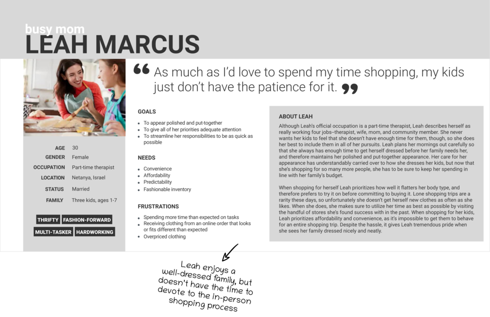
USER PERSONA
Based on my user research I crafted a user persona, personifying one of Mirror’s target markets: the Busy Mom. Leah embodied the dichotomy that I uncovered between the love of creativity and self-expression that many women have when shopping for their clothes, as well as the frustration of the lack of time to go to the mall due to the responsibility that she has to her family. By creating Leah, I was able to reference her personality and priorities so that I could better empathize with users during my design process.
storyboard
I created a storyboard by melding a frustrating story one of my interviewees told me about an in-person shopping experience, along with the added stress of bringing kids along. Leah just landed a new job, and was on the hunt for comfortable yet professional new shoes. She brought her kids out to the mall to what she thought would be a short trip, but at each store she ran into a different problem—be it the shoe didn’t come in the color she needed, or the store was unable to order her size. In defeat, Leah returned home and gave online shopping a try, and was pleasantly surprised by how simple and easy her experience was. This storyboard was used as a tool to help me relate to my target user, and truly empathize with her plight for simple, easy-to-use shopping tools.
STEP THREE
IDEATE
Goal: To brainstorm potential solutions, organization of content, and flows
Process: Card Sorting, Sitemap, Task Flow
card sorting
I went into this project with a clear understanding of how I felt the site should be organized, based on commonly used clothing categories (Shirts, Pants, Skirts, etc.). I was very surprised, however, to see that my card sorting results indicated that people commonly categorize their clothing within other categories, such as style. Therefore, this exercise gave me a better understanding of how users make sense of large amounts of information, and how I can best design Mirror’s information architecture to be as intuitive and well-organized as possible.
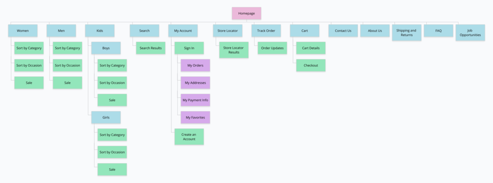
SITE MAP
Once I got a better sense of my target market’s priorities, needs, and pain points, I was able to use that information to inform how to best organize Mirror’s website. I thought through how users would navigate the website, and how they would most easily accomplish the tasks that they hope to complete.
TASK FLOWS
My research indicated that users want a fast and easy way to find items and checkout, so it was important to me that I developed a straightforward way for users to complete that task, with no dead ends. I made sure to incorporate my User Persona into the User Flow so that I could best empathize with my users as I went along. The Task Flow was another tool that helped me visualize the customer experience, and to ensure that it was as usable and straightforward as possible.
STEP FOUR
DESIGN
Goal: To design Mirror’s brand and user interface
Process: Sketches, Wireframes, Logo and Branding
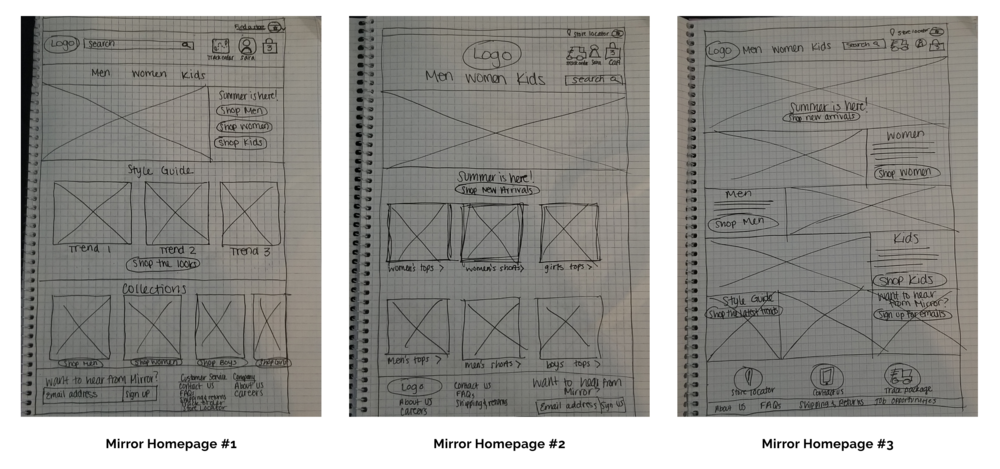
SKETCHES
In order to brainstorm the best solutions possible, I sketched several concepts of Mirror’s homepage. Sketching gave me the ability to quickly communicate my ideas, and to draw up alternative ways of presenting the information. I considered common design patterns, user needs and preferences, and various ways of organizing the photos so that they were as accessible as possible, no matter how users preferred to access their desired category.
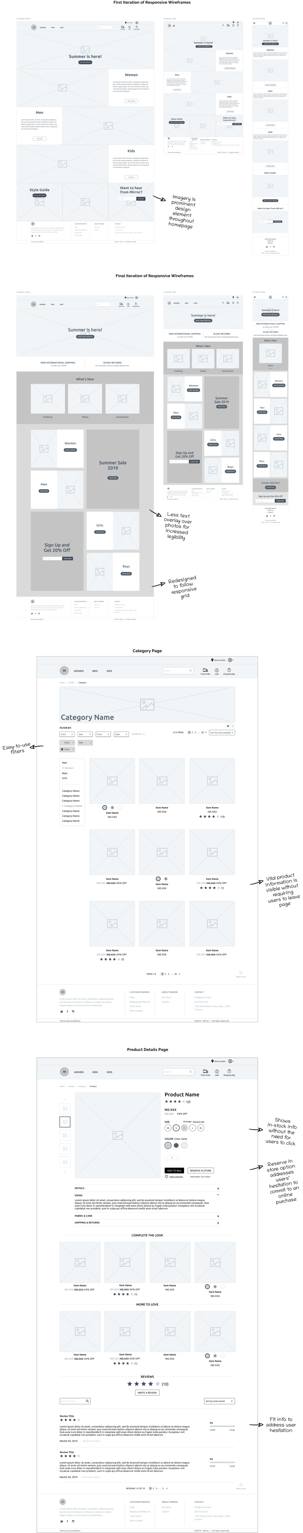
WIREFRAMES
Designing the responsive wireframes was a dynamic process, as I continually iterated based on feedback I received from my peers and mentor. Mirror’s homepage developed from my initial sketches into responsive designs that took into consideration frequently updated photos based on style season or promotions, text legibility, and business goals.
LOGO
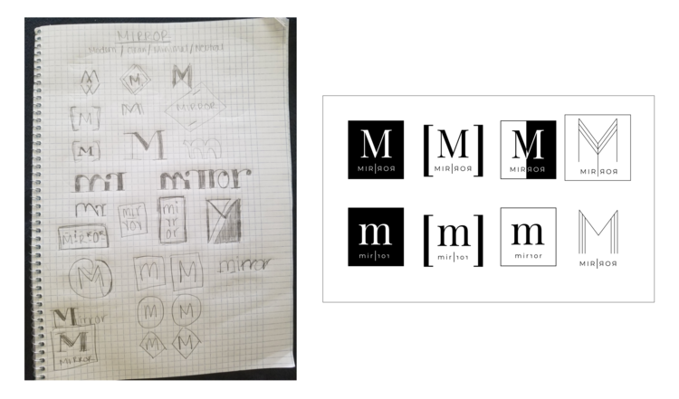
Mirror wanted to maintain their image of modern, clean, minimal and neutral. With those descriptors in mind, I began to brainstorm how I could embody their brand while appealing to a wide audience.
I began the logo design process by sketching out my ideas by hand, playing with the concept of typography mirroring itself, having letters shown in mirror image, and having a logo being placed within a frame, like a mirror. Once I felt that I had gotten a strong start, I digitized my logos and iterated on my favorite concepts.
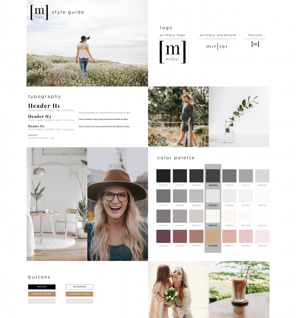
branding
I began my branding design process by keeping Mirror’s keywords in mind, and collecting a group of photos that I felt maintained a visual feel consistent with each other and with their brand keywords. Once those photos were selected, I isolated a cohesive group of colors and font selections that further communicated a brand feel that felt cohesive and targeted to Mirror’s target users.
STEP FIVE
prototype
Goal: To prototype Mirror’s desktop website and to obtain feedback based on usability testing
Process: High Fidelity Prototype, Usability Testing
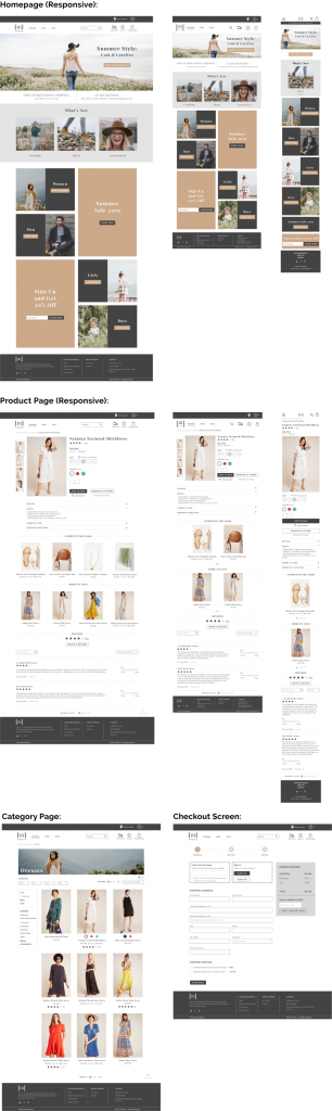
high fidelity prototype
Utilizing my wireframes and Style Tile, I created Mirror’s prototypes for screens such as the homepage, category page, product page, and checkout pages. I focused on each detail, making sure that everything was as cohesive as possible. This process was in preparation for the usability testing which I was about to conduct.
USABILITY TESTING
Although I was proud of all the work that went into designing Mirror’s brand and site design, the real work truly began when it was time to put my designs to the test. It is only when my designs have been validated and improved based on user testing that I can say I truly accomplished my goal.
Objectives:
-
Observe how users navigate throughout the website
-
Determine if users seem to easily be able to complete their tasks
-
Identify areas of the prototype that seem to cause confusion and need improvement
User Tasks:
-
Navigate through the site to find a white dress.
-
Once you have found the dress, proceed to checkout with a dress in size small.
-
You purchase the dress, using the guest checkout option.
STEP SIX
ITERATE
Goal: To update my designs based on common patterns found in usability testing
Process: Affinity Map, Revisions
AFFINITY MAP & REvisions
My usability testing revealed a few key findings. I organized the trends, themes, and areas of opportunity for discovery and improvement based on usability testing on the Affinity Map.
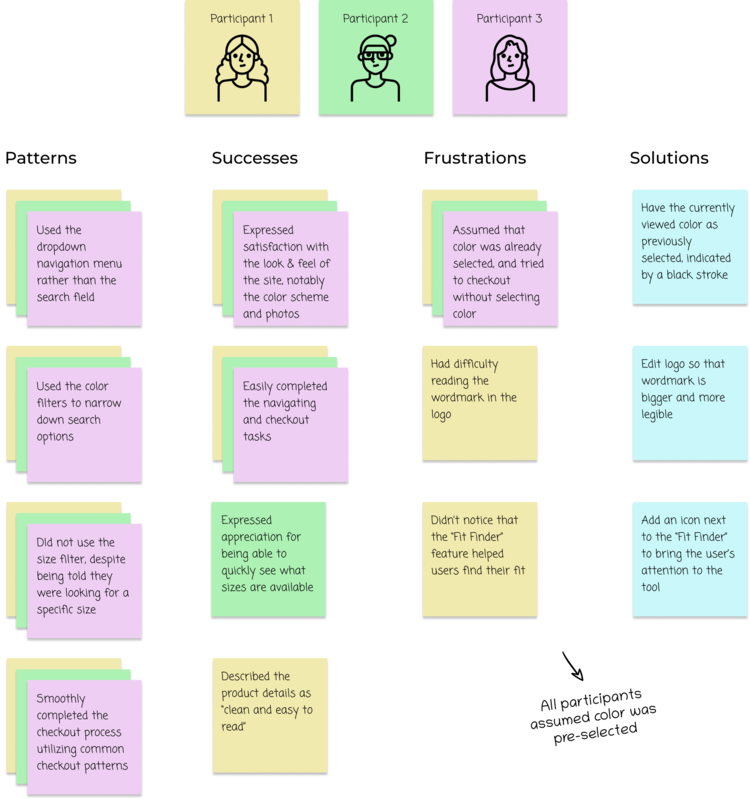
Based on this feedback, I established three priority revisions that needed to take place:
-
Pre-select the currently viewed color of each product, rather than requiring the user to select it
-
Edit logo so that wordmark is larger and more legible
-
Make “Fit Finder” more noticeable by adding an icon alongside it
reflection & next steps
My main goals in completing this project were to establish a responsive e-commerce website, as well as to develop new branding and a logo for Mirror. Throughout the design process, from researching, defining, ideating, designing, prototyping and iterating, I was able to accomplish these goals.
However, there are always ways to improve. With further testing my final revisions, it would be great to see if my solutions were successful in solving users’ initial frustrations and stated areas for improvement. Once that was completed, I would hand-off my final prototype to developers. Based on my initial research of how users enjoy “window shopping,” it would also be great to expand on my site navigation, and provide users with alternate ways of browsing current trends and styles.